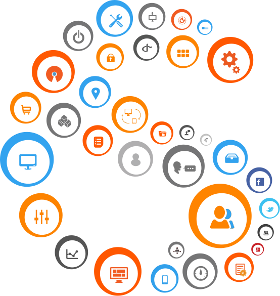
Discover unlimited web possibilities with a wide range of modules and templates
Drag and drop widgets
Plug and Play modules
Easy Layout Management
Specialised Templating System
Take control of your content on the fly
Discover unlimited web possibilities with a wide range of modules and templates
01
Content Management Framework
SageFrame not only builds and manages websites but also is designed to support the development of a customized web application out of itself.
02
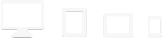
Mobile SageFrame
SageFrame is device-neutral, meaning you can take full control of your system from any mobile devices with the design preserved thereof.
03
Digital Marketing System
SageFrame has a tight integration of various marketing tools that your business needs to make it right ahead on the web.
04
Enterprise eCommerce
SageFrame provides a comprehensive in-house eCommerce solution that helps build, deploy and market your online store in minutes.
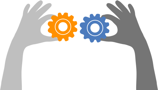
SageFrame Partner Program
Let’s partner to reap the benefits of SageFrame CMS together… Becoming our partner will ensure that you share the same expertise and experience as we do and are authorized for that matter.
Partnership Benefits
Be a part of SageFrame and accompany the best CMS in ASP.NET
Combine our expertise with your innovative ideas to provide your business a much needed boost
Discover new market possibilities for your growing business
Gain access to SageFrame’s premium resources and expertise including its modules
Have your company’s profile featured in our website as partners
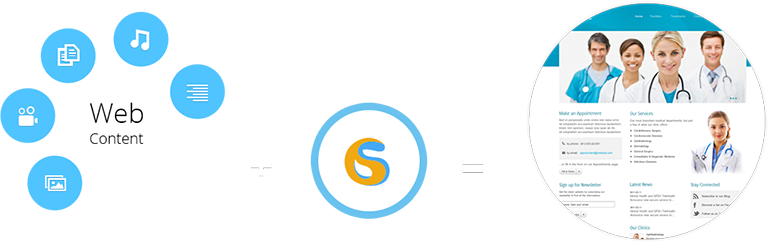
Your web content when blended with the power of Sageframe gives an exquisite and effectual texture to your site,thus making your business more result-driven.
Sound & Music | Text | Documents | Image | Video
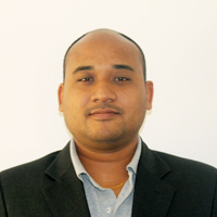
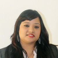
Leadership
SageFrame Leadership comprises of the most competent people in the industry. Our team leaders are well informed, dedicated and highly ethical who have carved a niche in global CMS industry on whole.
Hari Man Pradhan
Chairman
Nischal Man Pradhan
CEO
Alok Pandey
Project Manager
Aliza Tamrakar
Operation Manager
Hani Pradhan
Marketing Manager
Profile
Your web content when blended with the power of Sageframe gives an exquisite and effectual texture to your site,thus making your business more result-driven.
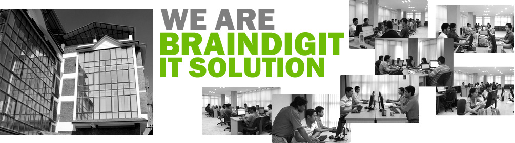
Since its inception in 2008, BRAINDIGIT IT SOLUTION has been one of the major contributors to the global market in Business Application Development, Enterprise Content Management, Mobile Apps Development and Collaborative eCommerce Solution.
BRAINDIGIT IT Solution provides one of the best services globally to meet all the IT needs of your business. With extensive analytical research and the best heads working for providing solutions, your business is tailored, not only to be different but to be the best.
Our development center is located at Kathmandu, Nepal with contact offices in Canada and the Philippines. The development center is equipped with resources to cater to the needs of the team, the projects and the clients. The resources range from, but are not limited to, latest hardware and network facilities to a highly skilled workforce. This in turn allows BRAINDIGIT to come up with world class web applications and software.
Here at BRAINDIGIT we have highly dedicated and expert IT team providing world class solutions and support. Starting from the data analysis to development stage and finally from testing to the implementation phase, our expert team pays close attention to the minutest of details allowing us to provide an optimum solution for your business. Whilst many consider the work is done once the final output is ready, we take time to provide excellent support round the clock.
SageFrame in Action
Your online presence is now just a few steps away .


